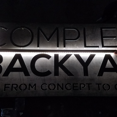
Crafting a Complete Custom Sign For The Complete Backyard
- jillduran9
- Jan 7, 2019
- 3 min read
There is an abundance of signage that bombards us on a daily basis. Think about the amount of signs you pass driving down the road. We have become so accustom to signage being displayed along every roadside that we now tune it out, it becomes completely obsolete. It takes a sign that is either obnoxious or beautifully distinguished to catch your attention. The owner of The Complete Backyard wanted the latter. The local small business came to Dark Horse with a vision to create signage to proudly display their logo on a well-crafted sign that would grab your attention for the right reasons, day or night.

The Complete Backyard was a great fit for Dark Horse. The company builds custom pool/spa/outdoor spaces with an exceptional focus on quality. Their core value and slogan is “quality from concept to creation.” This stuck out to us because Dark Horse’s welders and fabricators take a similar approach. There is a shared work ethic and pride in our workmanship for every repair and project we put our hands on.
Here are some of the intricate details about how this sign came to life for The Complete Backyard.
The Perfect Build
This specific sign was designed using The Complete Backyard original logo. We maintained the original logo design to keep their branding consistent. The idea for the sign was to build it so it had back lighting. Including details like lighting make the project multidimensional. It takes more skill and consideration for how it will be built and fabricated.
There were three layers to the overall build. Due to this setup, every layer and dimension had to be perfectly aligned with the letters to the main plate. Even the slightest design flaw here would not have been acceptable. Quality trumps convenience and doing it with precision gives you a better quality product in the end.
All of the letters were cut using our CNC plasma cutter. Then, we plug welded studs onto the letters to attach to the main plate. This technique creates a more streamlined, cleaner appearance for the finished product.
Well Lit Signage
The lighting for the sign took some creative thinking. To get the best look when lit we used LED strips to light up the sign. But, it took deflectors that were adhered so the light could be funneled to all the right places. This also created the right drop shadows to help the letter standout.
Creating The Right Color Contrast
When you work with a professional designer they’ll look at your project on both a big picture and a granular level. For example, how to choose the perfect color. Choosing the right color and finishing details make all the difference in having a great sign and avoiding a gaudy mess. We had to look at the environment and atmosphere where the sign was going to be displayed. We didn’t want the coloring to camouflage with the facade of the building, but rather compliment and contrast with it so the sign could stand out both day and night.

To finish, the sign was hung with invisible fasteners we coated to blend in with the main plate, creating a clean professional look and a durable mount system.
In The End
Details matter! Project builds like this, to be done well, need a custom hands-on approach to make sure the intricate details are not overlooked. It is what will make the finished product something you will be proud to display for many years.

[endif]


Comments